


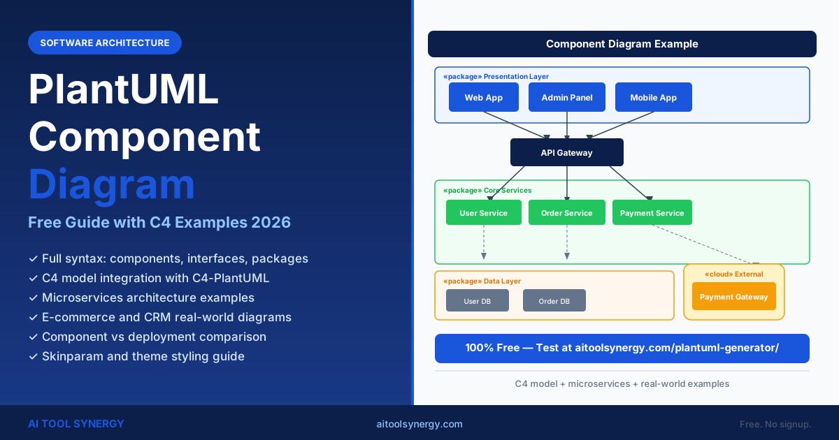
PlantUML Component Diagram: Free Guide with C4 Examples (2026)
A plantuml component diagram shows the static structure of a software system — the independent components (modules, services, subsystems), the interfaces they expose, and the dependencies between them. It is the UML diagram most commonly used for software architecture documentation and system design reviews.
This guide covers the full plantuml component diagram syntax, interface notation, package grouping, the difference between component and deployment diagrams, microservices mapping, C4 model integration, and real-world examples for e-commerce and CRM architectures.
Every code example in this guide works in our free PlantUML generator online — no Java needed, no install. Generate, preview, and export directly in the browser in under 30 seconds.
What Is a PlantUML Component Diagram and When Do You Use It?
A plantuml component diagram represents the static structure of a software system at the module or service level. It answers the question: “what are the major building blocks of this system and how do they connect?” Components are independent, replaceable units — a REST API, a frontend app, a caching layer, or a message queue.
Use this diagram type when you need to document system boundaries, explain how services communicate to new team members, review an architecture before building, plan a migration to microservices, or create the C3 level of a C4 model diagram set.
It differs from sequence diagrams (runtime interaction) and deployment diagrams (physical infrastructure). Component diagrams focus on logical software structure, not execution order or hardware placement. You can test examples immediately in our free PlantUML diagram generator.
PlantUML Component Diagram Syntax: Core Elements and Keywords
PlantUML component diagrams support two notations: square bracket shorthand ([Component]) and the explicit component keyword. Full syntax is documented at the official PlantUML component diagram reference. Both produce the same output. Choose square brackets for quick diagrams; use explicit declarations for named aliases and stereotypes.
Component Declaration Syntax
| Element | Syntax | Notes |
|---|---|---|
| Component (shorthand) | [Component Name] | Quickest way to declare |
| Component (explicit) | component "Name" as ALIAS | Use for aliases and stereotypes |
| Interface (circle) | () "Interface Name" as I | Ball notation (provided) |
| Interface (explicit) | interface "Name" as I | Same as () notation |
| Port | [C] - [I] | Attach interface to component |
| Dependency arrow | [A] --> [B] | Solid dependency |
| Usage (dashed) | [A] ..> [B] | Dashed usage / realization |
| Required interface | [C] -( [I] | Socket notation (requires) |
| Arrow with label | [A] --> [B] : HTTP/REST | Label the connection |
| Stereotype | component "Name" <<service>> | Adds stereotype label |
| Note | note right of [A] : text | Annotation on component |
| Hidden link (layout) | [A] -[hidden]-> [B] | Forces layout without visible arrow |
Basic Component Diagram Example
@startuml
[Frontend] --> [Backend API] : HTTPS
[Backend API] --> [Database] : JDBC
[Backend API] --> [Cache] : Redis
[Backend API] --> [Message Queue] : AMQP
@enduml
Named Components with Aliases
@startuml
component "User Service" as US
component "Auth Service" as AS
component "Email Service" as ES

interface "UserAPI" as UAPI
interface "AuthAPI" as AAPI

US - UAPI
AS - AAPI

US --> AS : verifies via
AS --> ES : sends confirmation via
@enduml
PlantUML Component Diagram Interfaces: Required and Provided
PlantUML supports two interface notations from UML 2: provided interfaces (ball / circle notation — what a component offers) and required interfaces (socket notation — what a component needs). Together they describe the exact contract between components.
| Interface Type | Syntax | UML Symbol | Meaning |
|---|---|---|---|
| Provided interface | [C] - () "API" | Ball (filled circle) | C provides this API to consumers |
| Required interface | [C] -( "API" | Socket (half-circle) | C requires this API to function |
| Explicit interface | interface "API" as I | Named interface node | Reusable across multiple connections |
| Interface with label | [A] - () "API" : REST | Ball with label | Label describes protocol or type |
@startuml
component "Order Service" as OS
component "Payment Service" as PS
component "Inventory Service" as IS

interface "OrderAPI"
interface "PaymentAPI"
interface "StockAPI"

OS - OrderAPI
PS - PaymentAPI
IS - StockAPI

' Order Service requires Payment and Inventory
OS -( PaymentAPI : processes payment via
OS -( StockAPI : checks stock via
@enduml
--> arrows with labels are cleaner and faster to write.PlantUML Component Diagram with Packages, Groups and Frames
PlantUML component diagrams support 12+ grouping constructs for organizing components into layers, domains, or infrastructure zones. Each grouping type has a different visual border style, making it easy to distinguish frontend, backend, and data layers at a glance.
| Grouping Type | Syntax | Typical Use |
|---|---|---|
| Package | package "Name" { ... } | Software layer or domain |
| Node | node "Name" { ... } | Physical or virtual machine |
| Frame | frame "Name" { ... } | System or subsystem boundary |
| Cloud | cloud "Name" { ... } | Cloud provider grouping |
| Database | database "Name" { ... } | Data store boundary |
| Rectangle | rectangle "Name" { ... } | Generic labelled boundary |
| Folder | folder "Name" { ... } | Module or directory grouping |
| Queue | queue "Name" { ... } | Message queue boundary |
| Stack | stack "Name" { ... } | Technology stack grouping |
| Boundary | boundary "Name" { ... } | Security or trust boundary |
@startuml
!theme cerulean

package "Presentation Layer" {
  [Web Application]
  [Admin Dashboard]
}

package "Business Logic Layer" {
  [User Service]
  [Product Service]
  [Order Service]
}

package "Data Layer" {
  database "Primary DB"
  database "Cache"
}

cloud "Third-Party" {
  [Payment Gateway]
  [Email Provider]
}

[Web Application] --> [User Service]
[Web Application] --> [Product Service]
[Admin Dashboard] --> [Order Service]
[User Service] --> "Primary DB"
[Product Service] --> "Cache"
[Order Service] --> [Payment Gateway]
[Order Service] --> [Email Provider]
@enduml
PlantUML Component Diagram vs Deployment Diagram: Key Differences
Component and deployment diagrams are often confused because both show system structure. The core difference is their focus level: component diagrams are about logical software modules, while deployment diagrams are about physical infrastructure — servers, containers, VMs, and network zones.
- Shows software modules, services, and subsystems
- Focuses on what the software is and how modules connect
- Elements:
[Component],() Interface,package - Ignores where software is deployed
- Maps to C4 model level C3 (Component)
- Used for: design reviews, onboarding docs, API contracts
- Shows servers, VMs, containers, and network zones
- Focuses on where software runs and how it is distributed
- Elements:
node,artifact,cloud - Ignores internal software module structure
- Maps to C4 model level C2 (Container) and infrastructure
- Used for: ops documentation, cloud architecture, DevOps planning
PlantUML Component Diagram for Microservices Architecture
The plantuml component diagram is well-suited to microservices documentation. Each microservice becomes a component, API gateways become routing components, and databases follow the database-per-service pattern. Message queues and event buses appear as component nodes between producers and consumers.
The key principle is one component per independently deployable service. Avoid grouping multiple microservices into a single component — the diagram should reflect actual deployment boundaries so architecture reviews can identify coupling issues.
@startuml
!theme materia

package "Client Layer" {
  [Web Client]
  [Mobile Client]
}

package "API Gateway" {
  [Gateway / Load Balancer]
}

package "Core Microservices" {
  [User Service]
  [Product Service]
  [Order Service]
  [Notification Service]
}

package "Data Stores" {
  database "User DB"
  database "Product DB"
  database "Order DB"
}

queue "Event Bus" as EB

[Web Client]    --> [Gateway / Load Balancer]
[Mobile Client] --> [Gateway / Load Balancer]
[Gateway / Load Balancer] --> [User Service]
[Gateway / Load Balancer] --> [Product Service]
[Gateway / Load Balancer] --> [Order Service]
[User Service]    --> "User DB"
[Product Service] --> "Product DB"
[Order Service]   --> "Order DB"
[Order Service]   --> EB : publishes OrderPlaced
EB --> [Notification Service] : subscribes
@endumlUsing the C4 Model with PlantUML Component Diagrams
The C4 model by Simon Brown defines four levels of software architecture documentation: System Context (C1), Containers (C2), Components (C3), and Code (C4). The PlantUML component diagram maps directly to C3 — the component level inside a single container.
The C4-PlantUML library on GitHub provides official macros that wrap standard PlantUML syntax in C4-specific element types with consistent styling. Include it with a single !include directive.
C4 Component Diagram with C4-PlantUML Macros
@startuml
!include https://raw.githubusercontent.com/plantuml-stdlib/C4-PlantUML/master/C4_Component.puml

LAYOUT_WITH_LEGEND()

Container(webApp, "Web Application", "React SPA", "Delivers the UI to users")
Container_Db(db, "Database", "PostgreSQL", "Stores user and order data")

Container_Boundary(api, "API Application (Spring Boot)") {
    Component(authC,  "Auth Component",  "Spring Security", "Handles login and token validation")
    Component(userC,  "User Component",  "Spring MVC",      "User profile management")
    Component(orderC, "Order Component", "Spring MVC",      "Order creation and tracking")
}

Rel(webApp, authC,  "Authenticates via",  "HTTPS/JSON")
Rel(webApp, userC,  "Manages profile via", "HTTPS/JSON")
Rel(webApp, orderC, "Places orders via",   "HTTPS/JSON")
Rel(authC,  db,     "Reads/writes",        "JDBC")
Rel(userC,  db,     "Reads/writes",        "JDBC")
Rel(orderC, db,     "Reads/writes",        "JDBC")
@enduml| C4 Level | What It Shows | PlantUML Diagram Type |
|---|---|---|
| C1 — System Context | Your system + external systems + users | C4_Context.puml |
| C2 — Containers | Applications, databases, microservices | C4_Container.puml |
| C3 — Components | Modules inside a single container | C4_Component.puml |
| C4 — Code | Classes and relationships | Standard class diagram |
--> arrows produces the same logical content. Use the library when your team follows the formal C4 model documentation standard; use plain syntax for internal architecture notes.Styling Your Component Diagram: Skinparam and Themes
Component diagrams support the full PlantUML skinparam system and all 40+ built-in themes. Applying a theme is the fastest way to change the visual style of your architecture diagram — add !theme NAME after @startuml. For precise color and font control, use the skinparam properties below.
| Skinparam Property | Example Value | Effect |
|---|---|---|
skinparam ComponentBackgroundColor | #dbeafe | Component box fill |
skinparam ComponentBorderColor | #1a56db | Component box border |
skinparam ComponentFontColor | #0c1f4a | Component label text |
skinparam InterfaceBackgroundColor | #1a56db | Interface circle fill |
skinparam ArrowColor | #374151 | All arrow colors |
skinparam ArrowFontColor | #64748b | Arrow label text |
skinparam PackageBackgroundColor | #f1f5f9 | Package fill |
skinparam PackageBorderColor | #94a3b8 | Package border |
skinparam Shadowing | false | Remove drop shadows |
skinparam RoundCorner | 8 | Rounded component corners |
Recommended themes for component diagrams: cerulean (professional blue), materia (clean material design), plain (minimal, good for print), and blueprint (dark technical style). See the full theme list in our PlantUML cheat sheet.
Real-World Examples: E-Commerce and CRM Architectures
These plantuml component diagram examples show production-grade system architectures you can adapt directly. For community-contributed architecture examples across many frameworks, real-world-plantuml.com has a large gallery. Each example uses packages for layer grouping, named aliases for readability, and arrow labels for protocol documentation.
E-Commerce Platform Component Diagram
@startuml
!theme cerulean
left to right direction

package "Customer Facing" {
  [Web Store]
  [Mobile App]
}

package "Core Services" {
  [API Gateway]
  [Product Catalog]
  [Shopping Cart]
  [Order Management]
  [Payment Service]
  [Inventory Service]
}

package "Data Stores" {
  database "Product DB"
  database "Order DB"
  database "Session Cache"
}

cloud "External Providers" {
  [Payment Gateway]
  [Email / SMS]
  [Shipping API]
}

[Web Store]   --> [API Gateway]
[Mobile App]  --> [API Gateway]
[API Gateway] --> [Product Catalog]
[API Gateway] --> [Shopping Cart]
[API Gateway] --> [Order Management]
[Shopping Cart]    --> "Session Cache"
[Product Catalog]  --> "Product DB"
[Order Management] --> [Payment Service]
[Order Management] --> [Inventory Service]
[Order Management] --> "Order DB"
[Payment Service]  --> [Payment Gateway]
[Order Management] --> [Email / SMS]
[Order Management] --> [Shipping API]
@enduml
SaaS CRM Component Diagram
@startuml
!theme materia

package "Web Layer" {
  [React SPA]
}

package "API Layer" {
  [Auth Service]
  [Contact Service]
  [Pipeline Service]
  [Reporting Service]
}

package "Integration Layer" {
  [Email Integration]
  [Calendar Sync]
  [Webhook Dispatcher]
}

package "Data Layer" {
  database "CRM Database"
  database "Analytics Store"
  database "File Storage"
}

[React SPA] --> [Auth Service]
[React SPA] --> [Contact Service]
[React SPA] --> [Pipeline Service]
[React SPA] --> [Reporting Service]
[Contact Service]  --> "CRM Database"
[Pipeline Service] --> "CRM Database"
[Reporting Service] --> "Analytics Store"
[Contact Service]  --> [Email Integration]
[Pipeline Service] --> [Webhook Dispatcher]
[Auth Service]     --> "File Storage"
@enduml
Best Practices for Software Architecture Teams
A well-drawn plantuml component diagram helps teams agree on system boundaries and reduces architecture drift. Follow these practices to keep your diagrams accurate and useful over time.
- 1One component per independently deployable unit
Map each independently deployable service to exactly one component. Avoid merging two services into one component — this hides real coupling and makes future migration discussions harder.
- 2Keep diagrams to 15 components or fewer
Diagrams with more than 15–20 components become hard to read. If your system is larger, split by domain: draw a top-level context diagram plus one component diagram per bounded context or microservice domain.
- 3Label all arrows with protocol or relationship type
Always label dependency arrows with the protocol or relationship type —
HTTPS/REST,gRPC,AMQP,JDBC. Unlabeled arrows hide important architectural decisions that matter for security reviews and performance analysis. - 4Store .puml files in your repository
Treat your component diagram source files as first-class code. Store
.pumlfiles in a/docs/architecture/folder, review changes in pull requests, and generate PNG exports in CI/CD so the rendered diagram is always current. - 5Apply a consistent theme across your diagram set
Use the same
!themeacross all component, deployment, and sequence diagrams in your project. Consistent visual language makes it easier for stakeholders to navigate between diagram types without re-learning visual conventions.
PlantUML Component Diagram — Frequently Asked Questions
A plantuml component diagram is used to document the static software architecture of a system — showing which modules, services, and subsystems exist and how they depend on each other. Common use cases include onboarding new developers, documenting microservices boundaries, creating C4 model C3 diagrams, planning API contracts, and reviewing architecture before and after refactoring.
Square brackets [Component] declare a software component — an independent module or service. Parentheses () Interface declare an interface contract. Use [C] - () "API" for a provided interface (ball notation) and [C] -( "API" for a required interface (socket notation).
These map to UML 2 lollipop and socket symbols respectively — provided interfaces show what a component offers, required interfaces show what it needs to function.
A component diagram shows logical software modules and their connections — what the software is. A deployment diagram shows physical infrastructure — servers, containers, and where software runs. Component diagrams use [Component] elements and package groupings. Deployment diagrams use node, artifact, and cloud elements. Draw both for complete architecture documentation.
Use the database "Name" keyword to add a database element to a component diagram. It renders with a cylinder icon. Connect it to components with a standard arrow: [User Service] --> "User DB". You can also place it inside a package "Data Layer" { ... } block to group it with other data stores.
Use the package "Layer Name" { ... } syntax to group components. Place component declarations inside the curly braces. PlantUML also supports frame, cloud, node, rectangle, and database as alternative grouping constructs — each renders with a different border style. Use package for software layers and cloud for cloud provider zones.
Yes — PlantUML component diagrams are ideal for microservices documentation. Map each independently deployable service to one component, use packages to group services by domain, and label arrows with protocols (REST, gRPC, AMQP). For event-driven architectures, use a queue element for the event bus between producers and consumers.
At the C4 model’s C3 level, component diagrams map directly to individual container internals — showing the modules inside a single container. Use the C4-PlantUML open-source library on GitHub for official C4 macro support with consistent styling. The library provides Component(), Container_Boundary(), and Rel() macros that match the formal C4 notation.
Add !theme THEME_NAME after @startuml for a quick visual preset — try cerulean, materia, or plain. For precise styling, use skinparam ComponentBackgroundColor, skinparam ComponentBorderColor, and skinparam ArrowColor. See our PlantUML cheat sheet for the full skinparam reference with example values.
Start with the three-layer example: package "Frontend" { [Web App] }, package "Backend" { [API] [Service] }, package "Data" { database "DB" }, then connect with arrows. This pattern covers 90% of real-world cases. Paste it into our free PlantUML generator to render and export instantly.
Related Articles








One Response
[…] those modules run — which server, cloud zone, or container hosts each component. See our complete PlantUML component diagram guide for the logical architecture […]