


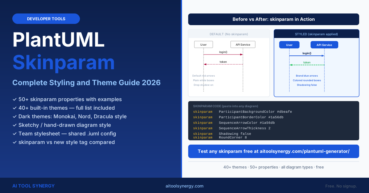
PlantUML Skinparam: Complete Styling and Theme Guide (2026)
PlantUML skinparam is the built-in styling system that controls colors, fonts, arrow styles, borders, and shadows across every diagram type. It works alongside the built-in theme library — skinparam provides precise property-level control, while themes apply a complete visual preset in a single line.
This guide covers the full plantuml skinparam property reference — color overrides, font settings, per-diagram-type styling, dark themes, the sketchy hand-drawn style, and how skinparam compares to the newer style tag syntax. Every example in this guide is ready to copy and test.
Test any plantuml skinparam code immediately in our free PlantUML generator online — no Java install required. Paste any code block, click Generate, and see the styled result in seconds.
What Is PlantUML Skinparam and How Does It Work?
PlantUML skinparam is a declarative styling command that overrides default visual properties at the diagram or element level. You write skinparam PropertyName value inside your diagram definition and PlantUML applies the style to all matching elements. Properties are camelCase and combine element type with property name.
The full plantuml skinparam reference is documented at plantuml.com/skinparam. There are two layers of styling in PlantUML:
| Approach | Syntax | Best For |
|---|---|---|
| Skinparam | skinparam ArrowColor #1a56db | Fine-grained property overrides; targeting specific element types |
| Theme | !theme cerulean | Quick full-diagram visual preset; consistent look across multiple diagrams |
| Style tag (new) | style .component { ... } | CSS-like selector syntax; introduced in PlantUML 2.x |
Skinparam overrides always win over theme defaults. You can combine !theme with skinparam to use a theme as a base and then fine-tune specific properties — for example, applying !theme cerulean and then overriding just the arrow color with a brand hex.
SequenceArrowColor (sequence diagram arrows), ClassBackgroundColor (class diagram fills), ParticipantBorderColor (sequence participant boxes). Global properties like ArrowColor apply to all diagram types unless overridden per-element-type.PlantUML Skinparam Color Properties: Background, Border and Arrow
Color values in plantuml skinparam use hex codes (#rrggbb or #rgb), named HTML colors (red, blue), or transparent. There is no support for rgba values in skinparam — use hex codes with solid colors only. The table below lists the most-used global and per-element color properties.
Global Color Properties
| Property | Default | Effect |
|---|---|---|
skinparam backgroundColor | white | Canvas background behind all elements |
skinparam ArrowColor | #A80036 | All arrows (all diagram types) |
skinparam ArrowFontColor | black | Arrow label text color |
skinparam BorderColor | #A80036 | All element borders globally |
skinparam FontColor | black | All text labels globally |
skinparam NoteBackgroundColor | #FEFECE | Note box fill (all diagram types) |
skinparam NoteBorderColor | #A80036 | Note box border |
skinparam Shadowing | true | Drop shadow on elements — set false to remove |
skinparam Monochrome | false | Set true for black-and-white output |
skinparam RoundCorner | 0 | Corner radius in pixels (e.g. 8 for rounded) |
skinparam Padding | 5 | Padding inside element boxes |
skinparam dpi | 96 | Output PNG resolution (e.g. 150 for sharper) |
Color Properties by Element Group
| Group | Background | Border | Font |
|---|---|---|---|
| Participant (Sequence) | ParticipantBackgroundColor | ParticipantBorderColor | ParticipantFontColor |
| Actor (Sequence) | ActorBackgroundColor | ActorBorderColor | ActorFontColor |
| Class | ClassBackgroundColor | ClassBorderColor | ClassFontColor |
| Class header | ClassHeaderBackgroundColor | — | ClassHeaderFontColor |
| Component | ComponentBackgroundColor | ComponentBorderColor | ComponentFontColor |
| Package / Frame | PackageBackgroundColor | PackageBorderColor | PackageFontColor |
| Activity / Action | ActivityBackgroundColor | ActivityBorderColor | ActivityFontColor |
| State | StateBackgroundColor | StateBorderColor | StateFontColor |
| Database (ER) | DatabaseBackgroundColor | DatabaseBorderColor | DatabaseFontColor |
PlantUML Skinparam Font: Name, Size, Color and Style
Font properties follow the same ElementType + PropertyName pattern. Global font settings apply to all text in the diagram. You can override per element type — for example, setting a larger font only for class diagram headers while keeping body text at the default size.
| Property | Type | Example Value | Effect |
|---|---|---|---|
skinparam FontName | Global | Helvetica | Font family for all labels |
skinparam FontSize | Global | 14 | Font size (px) for all labels |
skinparam FontColor | Global | #0c1f4a | Font color for all labels |
skinparam FontStyle | Global | Bold | Bold, Italic, Underline, or Plain |
skinparam ClassFontSize | Per-element | 13 | Class body text only |
skinparam ClassHeaderFontSize | Per-element | 14 | Class name in header bar |
skinparam ClassHeaderFontStyle | Per-element | Bold | Bold class names |
skinparam ParticipantFontSize | Per-element | 13 | Sequence participant label size |
skinparam ArrowFontSize | Per-element | 11 | Arrow label font size |
skinparam TitleFontSize | Per-element | 18 | Diagram title text size |
skinparam TitleFontStyle | Per-element | Bold | Bold diagram title |
@startuml
skinparam FontName "Segoe UI"
skinparam FontSize 13
skinparam FontColor #1e293b
skinparam TitleFontSize 18
skinparam TitleFontStyle Bold
skinparam ArrowFontSize 11

title User Login Flow

Alice -> Bob : POST /login
Bob --> Alice : 200 OK + token
@enduml
PlantUML Skinparam for Sequence Diagrams
Sequence diagrams have the widest skinparam support of any diagram type. You can control every visual element — participant boxes, activation bars, arrow colors and thickness, divider backgrounds, alt/loop frame fills, and note styling.
| Property | Controls |
|---|---|
skinparam SequenceArrowThickness | Arrow line width in pixels |
skinparam SequenceArrowColor | Overrides global ArrowColor for sequences only |
skinparam SequenceGroupBackgroundColor | alt/opt/loop frame fill |
skinparam SequenceGroupBorderColor | alt/opt/loop frame border |
skinparam SequenceDividerBackgroundColor | == Divider == fill color |
skinparam SequenceDividerFontColor | == Divider == text color |
skinparam LifelineBorderColor | Vertical lifeline dashed line color |
skinparam ActivationBorderColor | Activation bar border color |
skinparam ActivationBackgroundColor | Activation bar fill color |
@startuml
skinparam ParticipantBackgroundColor #dbeafe
skinparam ParticipantBorderColor #1a56db
skinparam ParticipantFontColor #0c1f4a
skinparam SequenceArrowColor #1a56db
skinparam SequenceArrowThickness 2
skinparam SequenceGroupBackgroundColor #f1f5f9
skinparam SequenceGroupBorderColor #cbd5e1
skinparam LifelineBorderColor #93c5fd
skinparam NoteBackgroundColor #eff6ff
skinparam NoteBorderColor #1a56db
skinparam Shadowing false

Alice -> Bob : Request
activate Bob
note right of Bob : Processing
Bob --> Alice : Response
deactivate Bob
@enduml
PlantUML Skinparam for Class and Component Diagrams
Class and component diagrams share the same general property naming pattern. Class diagrams add header-specific properties for the class name bar. Component diagrams add interface styling. Both respond to the global color and font properties as well as their own per-element overrides.
Class Diagram Skinparam
@startuml
skinparam ClassBackgroundColor #eff6ff
skinparam ClassBorderColor #1a56db
skinparam ClassHeaderBackgroundColor #1a56db
skinparam ClassHeaderFontColor #ffffff
skinparam ClassFontColor #0c1f4a
skinparam ClassFontSize 13
skinparam ArrowColor #374151
skinparam Shadowing false
skinparam RoundCorner 6

class User {
  +String name
  +String email
  +login()
}
class Admin {
  +resetPassword()
}
User <|-- Admin
@enduml
Component Diagram Skinparam
@startuml
skinparam ComponentBackgroundColor #dbeafe
skinparam ComponentBorderColor #1a56db
skinparam ComponentFontColor #0c1f4a
skinparam InterfaceBackgroundColor #1a56db
skinparam InterfaceFontColor #ffffff
skinparam PackageBackgroundColor #f8fafc
skinparam PackageBorderColor #94a3b8
skinparam ArrowColor #374151
skinparam Shadowing false

package "Backend" {
  [API Gateway]
  [User Service]
}
() "UserAPI"
[API Gateway] --> [User Service]
[User Service] - "UserAPI"
@enduml
PlantUML Skinparam Themes: Full List and How to Apply Them
Themes in PlantUML are pre-built skinparam bundles. Apply any theme with !theme THEME_NAME as the first line after @startuml. You can then override individual properties using standard skinparam after the theme declaration — your skinparam lines always win over the theme defaults.
The full plantuml skinparam theme list contains 40+ built-in options. Here are all currently available themes:
Preview all themes visually before choosing — the PlantUML themes gallery shows each theme applied to the same sequence diagram so you can compare styles at a glance.
cerulean or materia. Technical presentations: cyborg or superhero. Client-facing diagrams: minty or sandstone. Wireframes and prototypes: sketchy. Print output: plain or lightgray. Dark dashboards: cyborg or hacker.!theme and skinparam overrides into our free generator and see the styled diagram immediately. Supports all diagram types.Dark Mode and High-Contrast Themes: Monokai, Nord and Dracula
PlantUML does not include official Monokai, Nord, or Dracula themes by name, but several built-in themes produce equivalent dark aesthetics. The closest built-in dark themes are cyborg, hacker, neon, crt-amber, crt-green, and blueprint. You can also build a custom dark theme entirely with skinparam.
Built-in Dark Theme Options
| Theme | Background | Accent | Style |
|---|---|---|---|
cyborg | Dark navy | Bright blue | Bootstrap-dark inspired |
hacker | Black | Bright green | Terminal / matrix aesthetic |
neon | Very dark | Neon accents | High-contrast neon glow |
crt-amber | Near-black | Amber | Vintage CRT monitor look |
crt-green | Near-black | Green | Classic green-screen CRT |
blueprint | Dark blue | White lines | Technical blueprint drawing |
Custom Dark Theme with Skinparam
@startuml
' Custom dark theme approximating Monokai / Nord
skinparam backgroundColor #272822
skinparam ArrowColor #66d9e8
skinparam ParticipantBackgroundColor #3e3d32
skinparam ParticipantBorderColor #66d9e8
skinparam ParticipantFontColor #f8f8f2
skinparam ClassBackgroundColor #3e3d32
skinparam ClassBorderColor #a6e22e
skinparam ClassFontColor #f8f8f2
skinparam ClassHeaderBackgroundColor #1e1f1c
skinparam NoteBackgroundColor #1e1f1c
skinparam NoteBorderColor #75715e
skinparam Shadowing false
skinparam FontName "Courier New"

Alice -> Bob : authenticate
Bob --> Alice : token
@enduml
Sketchy and Hand-Drawn Style for Presentations
The sketchy theme renders diagrams in a hand-drawn, marker-on-whiteboard style — ideal for early-stage architecture discussions, client presentations, and any context where you want to signal that the design is still evolving. The sketchy-outline variant produces the same effect without filled backgrounds.
@startuml
!theme sketchy

title Team Meeting — Draft Architecture

[Frontend] --> [API]
[API] --> [Database]
[API] --> [Cache]

note right of [API]
  Still deciding on
  Redis vs Memcached
end note
@enduml
You can also achieve the hand-drawn look without the full theme using a single skinparam property: skinparam HandWritten true. This uses a built-in rough rendering algorithm and applies to all diagram types without changing any color settings.
cerulean or materia for the final documentation version.PlantUML Skinparam vs the New style Tag Syntax
PlantUML 2.x introduced a CSS-like style tag as an alternative to plantuml skinparam. It uses selector-based syntax — you define a class name starting with a dot and assign properties inside curly braces. Elements then reference the style with a stereotype. Both approaches coexist in current PlantUML versions.
- Works in all PlantUML versions
- Property-name approach:
skinparam ClassBackgroundColor #dbeafe - Targets element types globally
- Wider third-party documentation
- Stable and production-safe for all platforms
- Requires PlantUML 2.x or later
- Selector approach:
style .myClass { BackgroundColor: #dbeafe } - Targets individual elements by class name
- More flexible for mixed styles in one diagram
- Check server/extension version before using
@startuml
' New style tag syntax (PlantUML 2.x+)
style .highlighted {
  BackgroundColor: #dbeafe
  BorderColor: #1a56db
  FontColor: #0c1f4a
}

class User <<highlighted>> {
  +login()
}
class Order {
  +submit()
}
User "1" *-- "many" Order
@enduml
For maximum compatibility across VS Code extensions, Confluence plugins, GitLab renderers, and CI/CD pipelines, use standard skinparam syntax. Reserve the style tag for environments where you can confirm PlantUML 2.x is running.
Reusable Team Stylesheets and Shared Config Files
The most efficient way to keep all your team's diagrams visually consistent is to centralise all skinparam settings in a shared .iuml file stored in your repository. Every diagram then includes this file with a single line — and style changes propagate automatically to every diagram in the project.
Creating a Team Stylesheet
' File: /docs/styles/team-style.iuml
' Include in any diagram with: !include ../styles/team-style.iuml

skinparam backgroundColor #ffffff
skinparam ArrowColor #1a56db
skinparam ArrowFontColor #374151
skinparam ParticipantBackgroundColor #dbeafe
skinparam ParticipantBorderColor #1a56db
skinparam ParticipantFontColor #0c1f4a
skinparam ClassBackgroundColor #eff6ff
skinparam ClassBorderColor #1a56db
skinparam ClassHeaderBackgroundColor #0c1f4a
skinparam ClassHeaderFontColor #ffffff
skinparam ComponentBackgroundColor #dbeafe
skinparam ComponentBorderColor #1a56db
skinparam PackageBackgroundColor #f8fafc
skinparam PackageBorderColor #94a3b8
skinparam NoteBackgroundColor #eff6ff
skinparam NoteBorderColor #1a56db
skinparam Shadowing false
skinparam RoundCorner 8
skinparam FontName "Segoe UI"
skinparam FontSize 13
Using the Shared Stylesheet
@startuml
!include ../styles/team-style.iuml

title User Authentication Flow

Alice -> Bob : POST /login
Bob --> Alice : 200 + token
@enduml
team-style.iuml in a /docs/styles/ folder at the root of your repository. In your GitHub Actions or GitLab CI pipeline, run java -jar plantuml.jar -r -tsvg ./docs/ to recursively render all .puml files — the !include paths resolve relative to each file automatically.For teams that want to preview and validate skinparam styling without running a local PlantUML install, our free PlantUML generator online renders any skinparam configuration instantly in the browser. Paste the full diagram code including !theme and all skinparam lines to see the output.
PlantUML Skinparam — Frequently Asked Questions
PlantUML skinparam is the built-in CSS-like styling command that overrides visual properties — colors, fonts, shadows, borders, and arrows. Use it to match brand colors, remove default shadows (skinparam Shadowing false), change fonts, or create a custom color theme. For full presets, use !theme instead.
Add skinparam Shadowing false to your diagram. This removes the drop shadow from all elements globally — participants, class boxes, components, and packages. It is one of the most common skinparam settings for professional documentation because the default shadow can look dated in clean design contexts.
Use skinparam ArrowColor #HEX to change all arrows globally. For sequence diagrams only, use skinparam SequenceArrowColor #HEX. Arrow label text uses skinparam ArrowFontColor. Test any color combination live in our free PlantUML generator before updating your diagrams.
Yes — this is the recommended approach for team stylesheets. Apply the theme first with !theme cerulean, then add skinparam lines after it to override specific properties. Skinparam declarations always take precedence over theme defaults. For example, apply !theme materia as a base and then override skinparam ArrowColor with your brand hex code.
Add skinparam Monochrome true to your diagram. This converts all colors to grayscale. For a cleaner print output, combine it with skinparam Shadowing false and !theme plain. Alternatively, export to PDF using the -tpdf flag in local mode — PDF export preserves vector quality for any print size.
skinparam FontName sets the font family globally for all diagram text. skinparam ClassFontName overrides the font for class body text only. The ElementType prefix pattern works for all diagram types — ParticipantFontName, ComponentFontName, ActivityFontName — so you can mix fonts within a single diagram for different element types.
The plantuml.com/skinparam page lists all supported properties. For an alternative layout, the PlantUML documentation on ReadTheDocs organises them by diagram type. Our PlantUML cheat sheet includes the most commonly used skinparam properties for each diagram type in a quick-reference table.
Create a team-style.iuml file with all your skinparam settings. Save it in your repository under /docs/styles/. In each .puml diagram file, add !include ../styles/team-style.iuml after @startuml. The !include path is relative to the diagram file location. Any change to the shared file applies instantly to all diagrams in the project.
No — skinparam does not support rgba() notation. Use solid hex codes (#rrggbb) or short hex (#rgb) for all color values. Named HTML colors like red and transparent are also supported. For semi-transparent effects, use a solid hex color that matches your intended look against the canvas background.
Related Articles